We sent out a creative invitation to UConn students to submit a logo that embodied core elements of CLEAN EARTH: clean energy (wind/solar/power grid), environment (water/trees/air/ecosystems etc.), humans (idea of “connectedness”), juxtaposition of Regional (New England) and Global application, equity and sustainability.
While there was only one winner for the competition, we were inspired by their logos and descriptions we wanted to share the inspiration with the UConn & CLEAN EARTH community at large!

Alexus Armoogam. When designing this logo I tried to go for a happy and optimistic feel since the Clean Earth project takes steps towards a healthier and brighter planet. The words 'Clean Earth' are made to replicate water as the 'n' fuses with the 'h' for a fluid look and the sides are shiny to look clean. I believe the words 'clean' and 'earth' should be connected and I wanted to replicate that. I also wanted to showcase the way ecosystems connect, so the happy earth is there as well as the stars. The earth also symbolizes the unity of humans as we all share the same planet.
Anu Verma. In my logo design, I have attempted to highlight the concept of an entirely renewable-energy powered society. The outer shape of the logo depicts a light bulb which instantly conveys the idea of renewable energy electrification. Inside of the light bulb, we see people living in harmony with nature. People riding bicycles instead of cars have been shown to convey the willingness of the general public to shift towards non-polluting transportation alternatives. Windmills shown among buildings depict that the use of wind energy is commonplace, while the sun, on the top right corner, shows the potential to harness solar energy. The wave-like curvature of the road subtlety shows how hydroelectric energy could be used to fuel the power needs of the community. The color theme chosen for the logo include warm shades of green further highlighting the consonance of renewable energy and a culture that appreciates it's widespread adoption.
Isabel Nip. By re-arranging various aspects of my logo throughout development, I attempted to say the most with the fewest elements possible. To incorporate human connectedness, I based the logo on the idea of a person hugging the Earth, represented by globe lines. One hand is holding a green leaf, and the other hand becomes an electric source, symbolizing that the person is taking care of the Earth by producing clean energy. The entire logo appears like a globe on a stand, indicating scholarly activity and CLEAN EARTH as a research hub. To integrate the juxtaposition of regional (New England) with global application of clean energy, I shaped the person’s body/globe stand into an “NE” for New England. I aim for these symbols together to convey the message that New England is the center “to support decarbonization policy, climate adaptation, and grid modernization through innovative technologies and science-based solutions” (CLEAN EARTH) with a global reach.
Archisa Jaiswal. This logo embodies the characteristics of what a clean, sustainable Earth should be. The hands that hold up the Earth represent the idea that maintaining and protecting our environment and planet is within our own hands. The health of our planet is our individual responsibility. The sun, solar grid, wind turbine, and water waves are symbols of different forms of clean energy. The two humans who are connected by the curved yellow line symbolize human connectedness and how all humans need to work together to maintain Earth’s health. The North America outline included within Earth shows the juxtaposition of regional and global applications. The green leaf wrapped around Earth shows that an ideal environment is where the needs of the present are met and protected without compromising the ability of future generations to meet their own needs. The presence of birds in the sky shows an environment where all living beings including birds and animals can thrive. In addition, it represents how humans can also freely fly and meet their dreams if we live on a clean and healthy Earth.
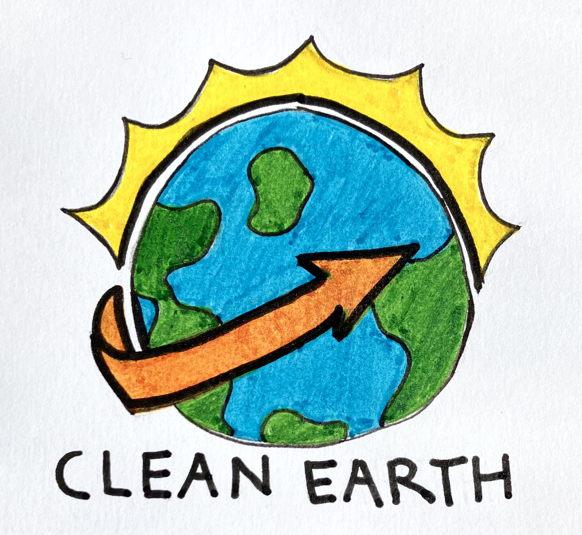
Moera Kamimura. My logo is about bringing forth a new and improved day through energy efficiency and sustainability. It has a simple, yet effective design intended to reflect the hopes of this CLEAN EARTH project as well. The orange arrow--the color of excitement--points to the radiating sunshine, the core of all our energy, transitioning to a new and improved tomorrow through renewable energy. Providing energy equity is a key theme that I wanted to highlight as well, hence, the earth in the center, emphasizing the people and environment.
Suleymar Dominguez. My logo represents before and after pollution & destruction of habitat. Deforestation and Climate change are the main themes. In the bottom right cycle there's a positive image demonstrating what we should aim for. Centered in the middle is our CLEAN Earth. Inside the earth is a silhouette of numerous people around the globe. Together we unite to keep the world healthy no matter what age, gender, race, ethnicity and so on. The two people jogging are an example that we run our world and it's in our hands.
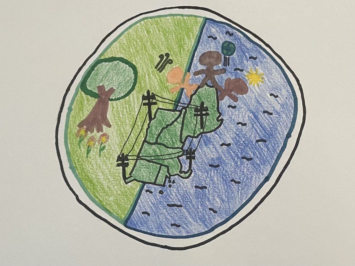
Isabella Blasi. The logo is slightly tilted to model Earth’s tilt on its axis. Half of the logo is green, and the other half of it is blue to represent Eversource’s work in both land and aquatic ecosystems. In the center, there is a map of New England, which represents the region UConn Eversource is based out of. The four electric power grids all around New England signify not only Eversource’s electric power grids but also their connectivity and, more importantly, the sustainability all their projects have. The three humans standing on top of Maine represent the equity Eversource stands behind. The symbols for sun and wind above two of the people’s heads represent wind and solar power. Finally, the person in the center is throwing up a globe, representing the juxtaposition of Regional (New England) and Global application.

Emily Laput. Infinity - an infinite loop. It represents interconnectedness, dedication, and the life cycle. The themes of CLEAN EARTH capture the essence of the infinity symbol. The project is dedicated to preserving life on Earth through clean energy, equitable, and sustainable practices. They are increasing people’s access to safer and more green energy sources. I have a plant growing out of the infinity symbol because this project is helping our community grow and is helping our planet stay healthy. Notice how the plant looks fresh and bright, and there’s no wilting. The plant also represents hope and the future because it has the potential to become a beautiful daisy, or lemon tree, or morning glory vine. The infinity sign and plant embody CLEAN EARTH and its principles through symbolism.

Talia Milardo. I like to create designs that are more simplistic and showcase minimalistic art. I wanted to focus on the themes of humans and the idea of connectedness and sustainability. With this I choose to showcase two human hands pinky promising to keep the “earth clean”. My concept behind this is that the only way for the earth to be kept clean is for humans to be the ones to do that. Humans are the ones who are ultimately in control and we have the power to make a difference. I really wanted this to be the main focus, as this also correlates the connectedness portion where as humans we can come together for the better of the earth.
Kaley Luk. For this logo I tried combining aspects of humanity and the environment. The logo is meant to look like a tree with two hands making up the trunk and teardrops making up the leaves, with one of them representing water. To me, it represents people coming together to support environmental issues. The colors, while representing the earth, also invoke the feelings of balance and serenity. This logo can also be printed without the different colors and still hold the same meaning since it has a clear silhouette.